This article is more or less a recreation of the article Using Storybook To Preview Single Directory Components, but centered around the SDC Component Library module instead. As such, there will be a little bit of duplicaton, but each article is self contained so you don’t need to jump back and forward between the pages.This page will scan your currently active themes to look for components, which will then be displayed inside this interface. You need to configure each component to show it in this interface, so the library will just show you an error message for all of your components.Now that we have previewed the Author component inside Storybook and checked that it works correctly we can add it to our theme. The author component I created at the start is now being used by this theme in the following way (inside a Author minimal view mode template).Now that we have a story for our component we can expand on this to create multiple stories in a single story file. Doing this is important when creating components as different properties and markup can cause the component to behave in different ways. It is essential that you add examples of the component with different data in order to correctly test them.For this example I will create a simple author component that will display the name, bio, and avatar of the author of an article. Here are the needed files for this component to function.
Creating A Single Directory Component
Single Directory Components (SDC) consist of a directory of files that go together to create a small component on a Drupal website. SDC can be nested together, which means that a consistent set of elements can be created and plugged together on a site.Just be aware that the components library is rendered using the currently active theme so all of the usual Drupal styles are also injected into the page as well. {% embed 'my_theme:componentName' with {a_property: 'A value'} %}
{% endembed %}
<aside class="author">

<div>

{% block avatar %}

{{ avatar }}

{% endblock %}

</div>

<div class="author_bio">

<p>

<a href="{{ author_url }}" rel="bookmark">

<span>{{ name }}</span>

</a>

</p>

{% block bio %}

{{ bio }}

{% endblock %}

</div>

</aside>
aside.author {

clear: both;

box-shadow: 0 10px 15px -3px rgba(0, 0, 0, 10%), 0 4px 6px -2px rgba(0, 0, 0, 10%);

padding: 1rem;

margin-bottom: 2rem;

margin-top: 2rem;

display: flex;

aside.author:first-child {

width: 20%;

text-align: center;

img {

max-width: 100%;

height: auto;

}

}

aside.author:last-child {

width: 80%;

}

div.author_bio {

margin-left: 1rem;

p {

margin-top: 0;

}

}

}
It is possible to add an SDC to your Drupal site without adding them into tempaltes first. You can use the SDC Component Library module to preview them whilst you are building them, and then integrate them into your site once they are ready.I mentioned earlier that the module looks for components in every active theme, and this can cause components from other themes to be displayed in your currently active theme. This can be a bit of an annoyance if you have active themes that you have components in, but don’t want them to display. There are no hooks or other triggers that you can intercept during the discovery process.For simple components that just need a couple of props values you can use the embed tag to include the component and inject your values in to it.
Installing The SDC Components Module
The author.component.yml file defines an author URL as a property and a a few slots to pass in the name, bio, and avatar information.In the main author.twig file we create some simple markup and add in the attributes defined in the author.component.yml file. The blocks are important here, but they will only become useful when we setup the stories for the SDC Component Library module, which we will cover later in the article.{{ include('hashbangcode_theme:author', {
author_url: url,
name: label,
bio: content.field_author_short_bio,
avatar: content.field_author_avatar
}) }}
This is a really good module and should be part of your workflow if you don’t want to deal with Storybook. I do, however, think that Storybook comes with several advantages over this module, including the ability to manipulate the components on the fly throught the interface. Altering the content throught the interface means you can test the component using different settings and is a key feature of using Storybook.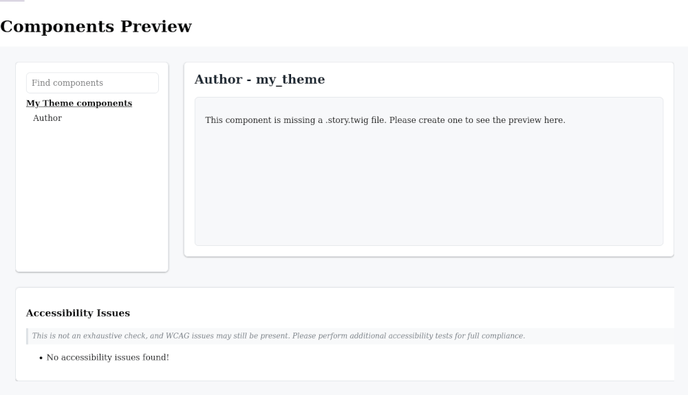
composer require drupal/sdc_component_library
We won’t do a deep dive into SDC here since it can be a large subject, so we’ll just create the needed elements. If you want more information then the official Drupal documentation on SDC is actually very good. There is also a Drupal 10 Theme Development book that has a comprehensive guide on building and using SDC in Drupal.The SDC Component Library module will include any additional styles or JavaScript files that are part of the component so your component should be a 1:1 representation of how it will act when added to the theme.The power of SDC comes from their ability to be self contained. If you have the need to build a complex component that displays data in a widget then building it as a SDC means that you can ensure that every time you include it, the same widget will be shown.To preview an SDC in SDC Component Library we first need to create one, this will be used as an example thoughout the rest of the article. It is assumed that you have a custom theme that you can build an SDC in.The ability to quickly preview component inside the Drupal theme is a really powerful tool. Plus, unlike Storybook, there is no setup or other configuraiton to perform for the components. All you need is the module, permission to view the SDC Component Library page, and the relevant story file for each component. There is no fiddling with CORS settings or segmenting your deployments to prevent those rules from hitting your production site.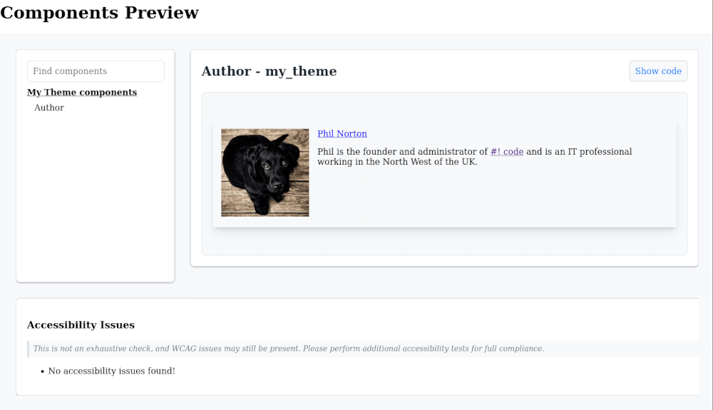
<component name>.story.twig file, but I’d argue that the issue it spots in this setup would still appear on the live site.name: Author
description: "Display author information"
props:
type: object
properties:
author_url:
type: string
title: Author URL
examples:
- /author/philipnorton42
slots:
name:
title: "Name"
bio:
title: "Bio"
avatar:
title: "Avatar"
Nice!
Adding Multiple Stories
{% set bio %}

<p>Phil is the founder and administrator of <a href="https://www.hashbangcode.com">#! code</a> and is an IT professional working in the North West of the UK.</p>

{% endset %}
{% set avatar %}
<img loading="lazy" src="https://picsum.photos/id/237/480/480" width="480" height="480" alt="Test image" class="image-style-large">
{% endset %}
{% include 'my_theme:author' with {
author_url: '/author/philipnorton42',
name: 'Phil Norton',
bio: bio,
avatar: avatar
} only %}
Require the module in the normal way, using composer.This is possible to do with the SDC Component Library module by adding multiple stories to the same story twig file. 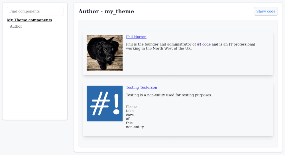
{% set some_slot %}

<p>Some prop that contains markup.</p>

{% endset %}
{{ include('my_theme:componentName', {
some_slot
}) }}
{# First story #}

{% set bio %}

<p>Phil is the founder and administrator of <a href="https://www.hashbangcode.com">#! code</a> and is an IT professional working in the North West of the UK.</p>

{% endset %}
{% set avatar %}
<img loading="lazy" src="https://picsum.photos/id/237/480/480" width="480" height="480" alt="Phil Nortons profile image" class="image-style-large">
{% endset %}
{% include 'my_theme:author' with {
author_url: '/author/philipnorton42',
name: 'Phil Norton',
bio: bio,
avatar: avatar
} only %}
{# Second story #}
{% set bio %}
<p>Testing is a non-entity used for testing purposes.<br><br><br>Please<br>take<br>care<br>of<br>this<br>non-entity.</p>
{% endset %}
{% set avatar %}{% endset %}
{% include 'my_theme:author' with {
author_url: '/author/testing',
name: 'Testing Testerson',
bio: bio,
avatar: avatar
} only %}
One word of warning here, the components are rendered in the same template, one after the other, so you may see some issues with components interacting with each other. If this does happen then it shows that your component isn’t isolated enough and you should endevour to correct that. It can, however, show accessibiltiy issues that might not normally be encountered if the component is only shown once per page so there are a couple of benefits to doing this.In this article we will look at setting up a theme with an SDC, and then using the SDC Component Library module preview that component.drush state:set twig_debug 1
drush state:set twig_cache_disable 1
drush state:set disable_rendered_output_cache_bins 1
If you are actively developing components it is also a good idea to turn on Twig debug mode."minimum-stability": "beta",
By activating the module you can allow your components to be previewed directly within the site. Just make sure you set up the permissions correctly so that you aren’t allowing the page to be viewed anonymousely. Allowing anonymous access to the page isn’t a critical securtiy issue, but it might cause problems in search results (if indexed) or leak information about your site that shouldn’t be public, like components for upcomming pages.

