Single Directory Components (SDCs) have become a Drupal standard, introducing significant changes to how Drupal sites are developed. One major change is in how components can be modified. Traditionally, the front-end interface could be altered using various Drupal theme hooks. However, SDCs are less alterable compared to the traditional approach. This limitation is intentional and aligns with the Single principle in their name: all files required to render an SDC must reside within the same directory.
Why Artisan?
Configuring CSS properties can be tedious and error-prone. Even the most experienced front-end developers can overlook a possible value or need to re-check certain configurations. Artisan’s advanced form widgets simplify this process by displaying only valid configurations and values for each widget. Of course, there is always the option to manually input configurations if needed, ensuring no limitations.The main goal of the Artisan base theme is to provide a foundation that allows most of its components to be reused without requiring complete overwrites in the custom theme of a specific project. To achieve this, Artisan offers a functional design base that is easily extensible, as explained below.To facilitate collaboration between teams or replicate configurations across different projects, Artisan allows you to easily export and import your customized presets using JSON code. While Artisan settings are standard Drupal configurations, copying and pasting JSON into a text box is often quicker and more efficient than using Drupal’s configuration import/export functionality.Artisan is very new, but we are already using it as our base theme for new projects. We are aware of the revolution coming with the Drupal Starshot Initiative, Experience Builder, Recipes, and Single Directory Components (SDCs), so we plan to introduce any improvements and good practices the Community provides. Although SDCs are stable, there are many discussions on how to improve this feature and what the best approach is, depending on the use cases. This means we must keep a close eye on its development.
What does Artisan include?
Artisan is a Drupal base theme built on Bootstrap 5 and Sass. It offers easy theme configurations, theme presets (or variants), and extensive use of CSS variables.
Bootstrap 5
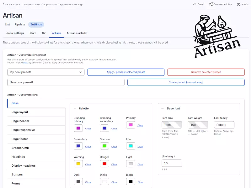
Artisan provides an extended theme settings form where various aspects can be customized, including the main color palette, page width, and font sizes for different elements.
Customizations with immediate results
Although we recommend using VLSuite to boost Layout Builder experience, Artisan does not require VLSuite as a dependency.
Artisan leverages SDCs to deliver its components. Since Artisan focuses on providing reusable components, its SDCs are designed with flexibility in mind to minimize the need for rewriting. This flexibility is achieved through the use of Twig templates and SDC-specific logic. While some situations may still require rewriting or overriding components, Artisan strives to reduce these cases as much as possible.
Form widgets with UX in mind
This settings form allows centralizing and reusing options such as colors, font sizes, or spacing, eliminating repetitive adjustments, reducing errors, and enabling a faster setup with a consistent visual identity.And after these fields are filled, the following CSS variables would be defined at the given selector, ready to be used:
Customization presets
Since creating a base visual guide for a new project can involve significant effort, Artisan includes several pre-built presets that can serve as starting points for further customization. This approach is ideal for accelerating the initial phase of a project without limiting future adjustments.As mentioned above, Artisan is extensible for advanced uses. By leveraging Drupal hooks, developers can register new customization options in the configuration form to generate additional CSS variables.
Export/import of presets
function artisan_starterkit_artisan_customizations_alter(&$customizations) {

$customizations['example'] = [

'wrapper' => 'component',

'label' => t('Example'),

'description' => t('My cool example component'),

'selector_default' => 'div[data-component-id="artisan_starterkit:example"]',

'list' => [

'font_size' => [

'label' => t('Font size'),

'type' => 'textfield'

'description' => 'My example component font-size',

],

'color' => [

'label' => t('Color'),

'type' => 'color',

'description' => 'My example component color',

],

],

];

}
Let’s see an example. Assuming we had filled the fields to define how the primary button looks and some basic styles such as body font-size and font-weight, we will get the following CSS variables defined:
SDC components with a twist
This feature not only improves workflow but also makes it easier to maintain visual consistency between related projects, such as a multi-site setup with a shared design base.As you may have guessed, each customization that you implement on the theme settings will end up in a CSS variable, defined at root or specific element/selector level, allowing granular control over styles. These CSS variables are used throughout the SDC components, ensuring coherence and consistency.These customizations are injected into the theme as CSS variables, so no theme compilation is required; results are visible immediately after saving. While these customizations are primarily based on Bootstrap CSS variables, they are not limited to them.
Efficient usage of CSS variables
In the next chunk of code, the fallback to Bootstrap variables, such as –bs-body-font-family or –bs-btn-color can be seen. In case you decide not to apply a specific style for an element from the theme settings, they will get the value from Bootstrap defaults.Let’s explore Artisan’s features in detail.Artisan also makes extensive use of CSS custom properties (commonly known as CSS variables) to fully leverage their benefits. By using these variables, you can easily reuse styles across your project, ensuring greater design consistency. Additionally, they simplify creating dynamic themes, such as Dark Mode or seasonal themes like Christmas.body {
--body-font-family: var(--theme-base-font-family, var(--bs-body-font-family, Roboto));
--body-font-size: var(--theme-base-font-size, var(--bs-body-font-size, 1rem));
--body-font-weight: var(--theme-base-font-weight, var(--bs-body-font-weight, 400));
--body-line-height: var(--theme-base-line-height, var(--bs-body-line-height, 1.5));
--body-color: var(--theme-body-color, var(--bs-body-color, black));
--body-background: var(--theme-body-background, var(--bs-body-bg, white));
font-family: var(--body-font-family);
font-size: var(--body-font-size);
font-weight: var(--body-font-weight);
line-height: var(--body-line-height);
color: var(--body-color);
background-color: var(--body-background);
}
.btn-primary {
--btn-primary-color: var(--theme-btn-primary-color, var(--bs-btn-color, white));
--btn-primary-background: var(--theme-btn-primary-background, var(--bs-btn-bg, black));
--btn-primary-border-color: var(--theme-btn-primary-border-color, var(--bs-btn-border-color, black));
--btn-primary-accent-color: var(--theme-btn-primary-accent-color, var(--bs-btn-hover-color, white));
--btn-primary-accent-background: var(--theme-btn-primary-accent-background, var(--bs-btn-hover-bg, black));
--btn-primary-accent-border-color: var(--theme-btn-primary-accent-border-color, var(--bs-btn-hover-border-color, black));
color: var(--btn-primary-color);
background-color: var(--btn-primary-background);
border-color: var(--btn-primary-border-color);
&:hover,
&:focus,
&:active {
color: var(--btn-primary-accent-color);
background-color: var(--btn-primary-accent-background);
border-color: var(--btn-primary-accent-border-color);
}
&[disabled] {
background-color: var(--btn-primary-background);
}
}
Artisan and VLSuite: a perfect match
div[data-component-id="artisan_starterkit:example"] {

--theme-example-font-size: 1rem;

--theme-example-color: #003310;

font-size: var(--theme-example-font-size);

color: var(--theme-example-color);

}
Check out Artisan on drupal.orgThe inspiration for Artisan comes from Radix, a well-known theme we used for a long time. However, once you master something that is not directly tailored to your needs, you may start to wish for changes—small ones at first, but larger ones over time. For example, we found ourselves overwriting too many base templates for our Drupal projects. We wanted the templates provided by the base theme to be extensible enough to avoid being discarded based on the needs of specific projects. In the end, we decided to create our own theme.
Extending Artisan: creating new customization options
Using hook_artisan_customizations_alter(), developers can add custom fields to the theme’s configuration form, allowing them to define new CSS variables ready to be used. This flexibility enables the theme to adapt seamlessly to different projects while supporting continuous evolution based on specific site requirements, all without modifying the core theme directly.All the settings in the theme settings form can be grouped into a preset, and Artisan allows you to create and manage multiple presets. This means you can have different configurations of your theme that can be applied with just a few clicks. For example, you can store theme variations such as a dark mode or seasonal themes and enable them as needed. Currently, this means that the theme variation is active for all users, but we plan to allow variations according different conditions. This would allow users to choice between dark or light variation, but internally it would be the same Drupal theme.We believe this approach enables developers to efficiently reuse components, saving time and effort across projects while maintaining design consistency.:root {
--theme-base-font-size:1rem;
--theme-base-font-weight:400;
--theme-base-font-family:Roboto;
--theme-base-font-line-height:1.5;
}
.btn-primary {
--theme-btn-primary-color: #ffffff;
--theme-btn-primary-background: #be16ca;
--theme-btn-primary-border-color: #be16ca;
--theme-btn-primary-accent-color: #be16ca;
--theme-btn-primary-accent-background: #a408af;
--theme-btn-primary-accent-border-color: #9a03a5;
}
Since Artisan is built on Bootstrap 5, you can fully leverage its features, including the robust grid system, mobile-first approach, and extensive utility classes. Additionally, Artisan serves as an abstraction layer over Bootstrap, offering an easy mechanism to configure many Bootstrap variables, as explained in the next section.
Future plans
We still think Radix is a great base theme; it’s just that we are ready to go our own way.In case you missed what VLSuite can do, check out our related article “Using VLSuite to copy Drupal.org home page”.


