const update = () => {

  let s = "";

  for (let i = 1; i <= rings.valueAsNumber; i++) {

    const r = spread.valueAsNumber * i;

    const theta = coords(dots.valueAsNumber * i);

    for (let j = 0; j < theta.length; j++) {

      s += `<li style="--_d:${theta[j]};--_r:${r}px;--_bgc:hsl(${random(

        50,

        25

      )},${random(90, 50)}%,${random(90, 60)}%)"></li>`;

    }

  }

  app.innerHTML = s;

}
const time = new Date();

const hour = -3600 * (time.getHours() % 12);

const mins = -60 * time.getMinutes();

app.style.setProperty('--_dm', `${mins}s`);

app.style.setProperty('--_dh', `${(hour+mins)}s`);
It looks like some sort of modern art experiment, right? Let’s introduce a new variable, --_r, to store the circle’s radius, which is equal to half of the circle’s width. This way, if the width (--_w) changes, the radius value (--_r) will also update — thanks to another CSS math function, calc():
The formula for the X coordinate is radius + (radius * cos(degree)). Let’s plug that into our new --_x variable:
Just messing around here, but we can quickly turn our clock into a circular image gallery by replacing the <time> tags with <img> then updating the width (--_w) and radius (--_r) values:
animation: turn 60s steps(60, end) infinite;
.clock-face time {

  --_x: calc(var(--_r) + (var(--_r) * cos(var(--_d))));

  --_y: calc(var(--_r) + (var(--_r) * sin(var(--_d))));

  --_sz: 12cqi;

  display: grid;

  height: var(--_sz);

  left: var(--_x);

  place-content: center;

  position: absolute;

  top: var(--_y);

  width: var(--_sz);

}
.minutes {

  animation-delay: var(--_dm, 0s);

  /* other styles */

}
.hours {
animation-delay: var(--_dh, 0s);
/* other styles */
}
--_r: calc((var(--_w) - var(--_sz)) / 2);
Let’s add another variable, --_d, that we can use to set a degree value for each number on the clock face. We’re going to increment the values by 30 degrees to complete our circle:
Placing things around a circle is a pretty basic example to demonstrate the powers of trigonometry functions like sin() and cos(). But it’s really cool that we are getting modern CSS features that provide new solutions for old workarounds I’m sure we’ll see way more interesting, complex, and creative use cases, especially as browser support comes to Chrome and Edge.
We’ll use an unordered list this time since the circles don’t follow a particular order. We’re not even going to put all the list items in the markup. Instead, let’s inject them with JavaScript and add a few controls we can use to manipulate the final result.
--_x: calc(var(--_r) + (var(--_r) * cos(var(--_d))));
animation: turn 3600s steps(60, end) infinite;
The controls are range inputs (<input type="range">) which we’ll wrap in a <form> and listen for the input event.
In the CSS, we need to add the animation-delay as well:
Let’s try one more. I mentioned earlier how the clock looked kind of like a modern art experiment. We can lean into that and re-create a pattern I saw on a poster (that I unfortunately didn’t buy) in an art gallery the other day. As I recall, it was called “Moon” and consisted of a bunch of dots forming a circle.
.seconds {

  --_abg: hsl(0, 5%, 40%);

  --_ah: 145px;

  --_aw: 2px;

  animation: turn 60s steps(60, end) infinite;

}

.minutes {

  --_abg: #333;

  --_ah: 145px;

  --_aw: 6px;

  animation: turn 3600s steps(60, end) infinite;

}

.hours {

  --_abg: #333;

  --_ah: 110px;

  --_aw: 6px;

  animation: turn 43200s linear infinite;

}
Let’s use a single CSS animation for that. First, let’s add three more elements to our markup,
.clock {

  --_w: 300px;

  --_r: calc(var(--_w) / 2);

  /* rest of styles */

}
animation: turn 43200s infinite;
Here’s what I have in mind. Again, it’s only supported in Firefox and Safari at the moment:
<form id="controls">

  <fieldset>

    <label>Number of rings

      <input type="range" min="2" max="12" value="10" id="rings" />

    </label>

    <label>Dots per ring

      <input type="range" min="5" max="12" value="7" id="dots" />

    </label>

    <label>Spread

      <input type="range" min="10" max="40" value="40" id="spread" />

    </label>

  </fieldset>

</form>
I also want the dots to be different colors. So, let’s randomize (well, not completely randomized) the HSL color value for each list item and store it as a new CSS variable, --_bgc:
const random = (max, min = 0, f = true) => f ? Math.floor(Math.random() * (max - min) + min) : Math.random() * max;
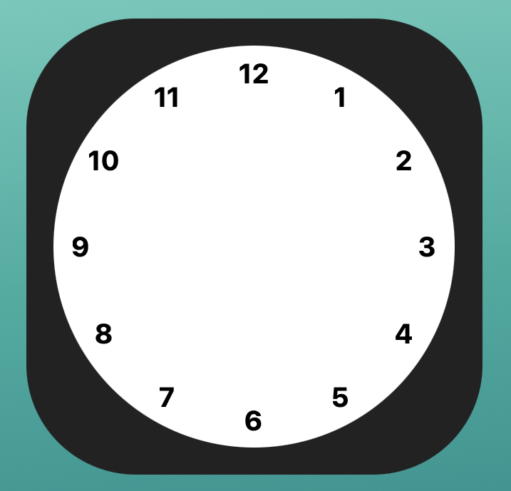
We could stop right here! We accomplished the goal of placing text around a circle, right? But what’s a clock without arms to show hours, minutes, and seconds?
CSS trigonometry functions are here! Well, they are if you’re using the latest versions of Firefox and Safari, that is. Having this sort of mathematical power in CSS opens up a whole bunch of possibilities. In this tutorial, I thought we’d dip our toes in the water to get a feel for a couple of the newer functions: sin() and cos().
@keyframes turn {

  to {

    transform: rotate(1turn);

  }

}
This definitely looks more like a clock! See how the top-left corner of each number is positioned at the correct place around the circle? We need to “shrink” the radius when calculating the positions for each number. We can deduct the size of a number (--_sz) from the size of the circle (--_w), before we calculate the radius:
What else can we do?
--_y: calc(var(--_r) + (var(--_r) * sin(var(--_d))));
.clock {

  --_ow: clamp(5rem, 60vw, 40rem);

  --_w: 88cqi;

  aspect-ratio: 1;

  background-color: tomato;

  border-radius: 50%;

  container-type: inline;

  display: grid;

  height: var(--_ow);

  place-content: center;

  position: relative;

  width var(--_ow);

}
<div class="clock">

  <!-- after <time>-tags -->

  <span class="arm seconds"></span>

  <span class="arm minutes"></span>

  <span class="arm hours"></span>

  <span class="arm center"></span>

</div>
@supports not (left: calc(1px * cos(45deg))) {

  time {

    left: 50% !important;

    top: 50% !important;

    transform: translate(-50%,-50%) rotate(var(--_d)) translate(var(--_r)) rotate(calc(-1*var(--_d)))

  }

}
.arm {

  background-color: var(--_abg);

  border-radius: calc(var(--_aw) * 2);

  display: block;

  height: var(--_ah);

  left: calc((var(--_w) - var(--_aw)) / 2);

  position: absolute;

  top: calc((var(--_w) / 2) - var(--_ah));

  transform: rotate(0deg);

  transform-origin: bottom;

  width: var(--_aw);

}
.clock time:nth-child(1) { --_d: 270deg; }

.clock time:nth-child(2) { --_d: 300deg; }

.clock time:nth-child(3) { --_d: 330deg; }

.clock time:nth-child(4) { --_d: 0deg; }

.clock time:nth-child(5) { --_d: 30deg; }

.clock time:nth-child(6) { --_d: 60deg; }

.clock time:nth-child(7) { --_d: 90deg; }

.clock time:nth-child(8) { --_d: 120deg; }

.clock time:nth-child(9) { --_d: 150deg; }

.clock time:nth-child(10) { --_d: 180deg; }

.clock time:nth-child(11) { --_d: 210deg; }

.clock time:nth-child(12) { --_d: 240deg; }
There are other trigonometry functions in the pipeline — including tan() — so why focus just on sin() and cos()? They happen to be perfect for the idea I have in mind, which is to place text along the edge of a circle. That’s been covered here on CSS-Tricks when Chris shared an approach that uses a Sass mixin. That was six years ago, so let’s give it the bleeding edge treatment.
<div class="clock">

  <div class="clock-face">

    <time datetime="12:00">12</time>

    <time datetime="1:00">1</time>

    <time datetime="2:00">2</time>

    <time datetime="3:00">3</time>

    <time datetime="4:00">4</time>

    <time datetime="5:00">5</time>

    <time datetime="6:00">6</time>

    <time datetime="7:00">7</time>

    <time datetime="8:00">8</time>

    <time datetime="9:00">9</time>

    <time datetime="10:00">10</time>

    <time datetime="11:00">11</time>

  </div>

</div>
So, it’s not exactly like words forming a circular shape, but we are placing text characters along the circle to form a clock face. Here’s some markup we can use to kick things off: