Focus, in regards to accessibility and the web experience, is the visual indicator that something is being interacted with on the page, in the UI, or within a component. CSS can tell when an interactive element is focused.
Form Accessibility?
Check out another great resource here on CSS-Tricks on using :focus-within.
You have most likely heard the term “accessibility” everywhere or the numeronym, a11y. What does it mean? That is a great question with so many answers. When we look at the physical world, accessibility means things like having sharps containers in your bathrooms at your business, making sure there are ramps for wheel assisted people, and having peripherals like large print keyboards on hand for anyone that needs it.
“The
:focusCSS pseudo-class represents an element (such as a form input) that has received focus. It is generally triggered when the user clicks or taps on an element or selects it with the keyboard’s Tab key.”The:focus-withinCSS pseudo-class matches an element if the element or any of its descendants are focused. In other words, it represents an element that is itself matched by the :focus pseudo-class or has a descendant that is matched by :focus. (This includes descendants in shadow trees.)
The gamut of accessibility doesn’t stop there, we have digital accessibility that we need to be cognizant of as well, not just for external users, but internal colleagues as well. Color contrast is a low hanging fruit that we should be able to nip in the bud. At our workplaces, making sure that if any employee needs assistive tech like a screen reader, we have that installed and available. There are a lot of things that need to be kept into consideration. This article will focus on web accessibility by keeping the WCAG (web content accessibility guidelines) in mind.
How To Focus
This pseudo class is really great when you want to emphasize that the user is in fact interacting with the element. You can change the background color of the whole form, for example. Or, if focus is moved into an input, you can make the label bold and larger of an input element when focus is moved into that input. What is happening below in the code snippets and examples is what is making the form accessible. :focus-within is just one way we can use CSS to our advantage.
Always make sure that the focus indicator or the ring around focusable elements maintains the proper color contrast through the experience.MDN (Mozilla Developer Network)
Hey all you wonderful developers out there! In this post, I am going to take you through creating a simple contact form using semantic HTML and an awesome CSS pseudo class known as :focus-within. The :focus-within class allows for great control over focus and letting your user know this is exactly where they are in the experience. Before we jump in, let’s get to the core of what web accessibility is.
The :focus-within pseudo class allows you to select an element when any descendent element it contains has focus.
*DO NOT DO what is below!
Using technology like semantic markup and CSS to create inclusive spaces is a crucial part in making the web a better place, let’s continue moving forward and changing lives.
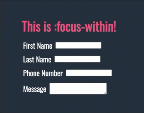
The final product looks something like below. Of course the possibilities are endless to change up the styling, but this should get you on a good track to make the web more accessible for everyone!
<form>

  <div>

    <label for="firstName">First Name</label><input id="firstName" type="text">

  </div>

  <div>

    <label for="lastName">Last Name</label><input id="lastName" type="text">

  </div>

  <div>

    <label for="phone">Phone Number</label><input id="phone" type="text">

  </div>

  <div>

    <label for="message">Message</label><textarea id="message"></textarea>

  </div>

</form>
CSS
<header>

  <h1>Semantic Markup</h1>

  <nav>

    <ul>

      <li><a href="/">Home</a></li>

      <li><a href="/about">About</a></li>

    </ul>

  </nav>

</header>
<section><!-- Code goes here --></section>
<section><!-- Code goes here --></section>
<aside><!-- Code goes here --></aside>
<footer><!-- Code goes here --></footer>
Another use case for using :focus-within would be turning the labels bold, a different color, or enlarging them for users with low vision. The example code for that would look something like below.
:focus-within in Action!
HTML
<form>

  <h1>:focus-within part 2!</h1>

  <label for="firstName">First Name: <input name="firstName" type="text" /></label>

  <label for="lastName">Last Name: <input name="lastName" type="text" /></label>

  <label for="phone">Phone number: <input type="tel" id="phone" /></label>

  <label for="message">Message: <textarea name="message" id="message"/></textarea></label>

</form>
CSS
Creating amazing, accessible user experience should always be a top priority when shipping software, not just externally but internally as well. We as developers, all the way up to senior leadership need to be cognizant of the challenges others face and how we can be ambassadors for the web platform to make it a better place.
:focus {

  outline: 0;

}
:focus {
outline: none;
}
Look Within!
Unless there is a custom component that needs to be created, then a div is fine to use, paired with ARIA (Accessible Rich Internet Applications). We can do a deep dive into ARIA in a later post. For now let’s focus…see what I did there…on this CSS pseudo class.
Conclusion
MDN (Mozilla Developer Network)
Focus is written like this and can be styled to match your branding if you choose to style it.
:focus {

  * / INSERT STYLES HERE /*

}
Whatever you do, never set your outline to 0 or none. Doing so will remove a visible focus indicator for everyone across the whole experience. If you need to remove focus, you can, but make sure to add that back in later. When you remove focus from your CSS or set the outline to 0 or none, it removes the focus ring for all your users. This is seen a lot when using a CSS reset. A CSS reset will reset the styles to a blank canvas. This way you are in charge of the empty canvas to style as you wish. If you wish to use a CSS reset, check out Josh Comeau’s reset.